Follow these steps to learn how to create and load Vortex themes.
Custom Themes - Vortex
Every Vortex app shares the same appearance system, so a theme made for one Vortex app works in all of them. A theme is a single JSON file you can write in any text editor: no programming, no build step. This guide is for anyone using a Vortex app; it walks through writing a theme and loading it.
(For how theming works on the developer side, theme links and the switching model, see the styling guide.)
The theme file
A theme is one JSON file: a name, a little metadata, and five palette attributes. This is sunset.json, the example used throughout this guide:
{
    "Sunset": {
        "_meta": {
            "publisher": "example",
            "type": "dark"
        },
        "Foreground": "#ffe8d6",
        "Gradient.Start": 0,
        "Gradient.Start Color": "#ff9e57",
        "Gradient.End": 1,
        "Gradient.End Color": "#d96c4f",
        "Primary": "#332027",
        "Secondary": "#291a20",
        "Tertiary": "#4a2b33"
    }
}
- The top-level key (
"Sunset") is the theme's name, shown in the theme list. _meta.publisheris your name or handle. Themes are identified as"<Name> (<publisher>)", so yourDarkand someone else'sDarkcan coexist._meta.typeis"dark"or"light", whichever your palette reads as.- The five palette attributes are required, and they are the same five in every theme. Colors are hex:
#RRGGBB, or#AARRGGBBwith the transparency in the first two digits. Gradientis a blend between two stops, written as four values:Gradient.StartandGradient.Endare positions running 0 to 1, andGradient.Start ColorandGradient.End Colorare their colors. (Themes written for Vortex 2.x used a"Gradient"list of"<position>:<color>"stops. A two-stop list still loads; longer lists fall back to the default gradient.)
The palette
Every widget in every Vortex app draws from the same five theme attributes, so filling in these five recolors everything:
| Attribute | What it colors |
|---|---|
| Foreground | Text and icons: must contrast against all three backgrounds |
| Gradient | The accent blend: window and dialog borders |
| Primary | Main backgrounds: windows, dialogs, pages |
| Secondary | Sub-element backgrounds: headers, sidebars, sections |
| Tertiary | Interactive backgrounds: buttons, tabs, text editors |
A workable recipe for a dark theme: pick a near-white Foreground, take three steps of one background hue (Primary in the middle, Secondary a step darker, Tertiary a step lighter), and give Gradient accent colors that pop against all three. For a light theme, invert the ladder.
Loading it
Save the file into a folder anywhere you like (for example ~/Themes/), then point the app at that folder:
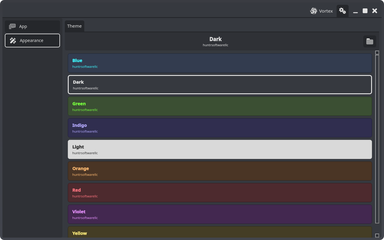
- Open the app's settings (the gear button in the title bar) and pick Appearance in the sidebar. The theme list shows every loaded theme, with the active one highlighted:
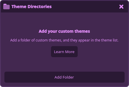
- Click the folder button beside the active theme's name. The Theme Directories dialog opens:
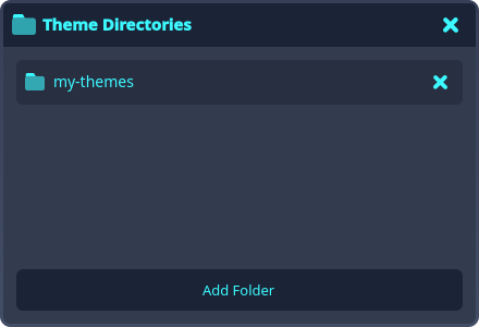
- Click Add Folder and pick your folder. Every
.jsontheme in it (subfolders included) loads, and the folder is remembered:
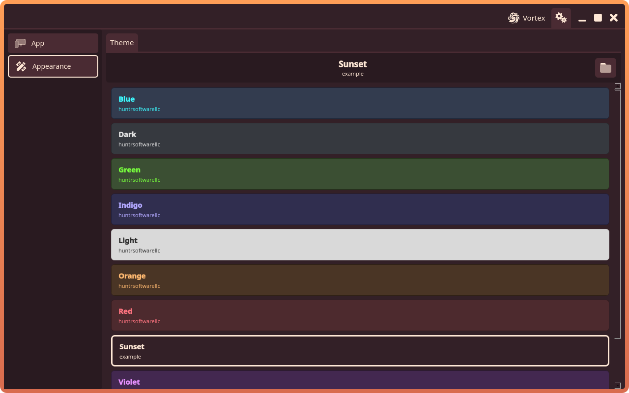
- Your theme is now in the theme list. Click it to apply; the selection persists across launches like any other theme:
To iterate on a palette, edit the file and restart the app (directories are re-read at launch), or remove and re-add the directory to reload it in place.
One theme, every Vortex app
Theme directories are added per app: each Vortex app keeps its own list, and adding a folder loads its themes into that app. The file format is identical across all Vortex apps though, so the same folder can be added to each Vortex app you use, and your theme follows you everywhere.
Platform notes:
- On desktop, the folder is read from disk at each launch, so edits show up on restart.
- In the browser, adding a directory imports a copy of its files (web pages cannot quietly re-read your disk), so re-add the folder to pick up later edits.
- On Android, the folder is picked with the system folder picker; the app keeps read access and re-reads it at each launch.
Trying it out
The Vortex demo is a plain Vortex app with the standard shell and settings menu, which makes it a handy theme playground: add your folder there and check your palette over the stock chrome, then bring it to your real apps.